This is a few little bits and bobs i been messing around with, to be treated more as a mood board rather than an indication to final projects, but hopefully it might coax out a bit of feedback from somewhere.
I gave the bands myspace a brief overhall, althought i just made it black but i will be making further progress on that as time goes buy. This fitness (or not) can be witnessed atttttttt
WWW.MYSPACE.COM/HAUNTSLONDON
You can have a little look about and feast your ears on some bangin choons....So to speak.
Also if your not at a disposition to flashing lights and you got a thing for "lo-fi" you can view the holding page for the website i made
The HAUNTS Webpage
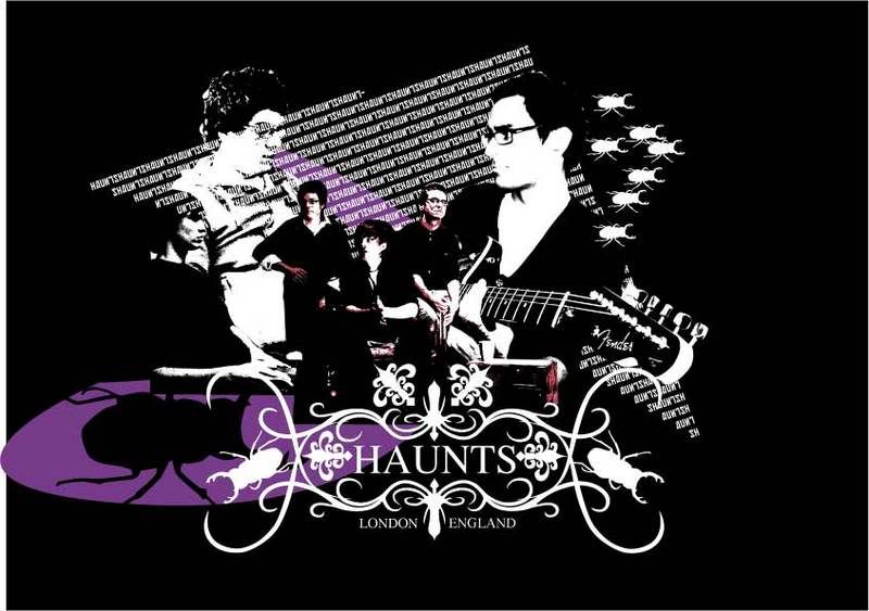
This is just a graphic montage for promotional use, just to get a few feelers out fo the graphic style or presentation

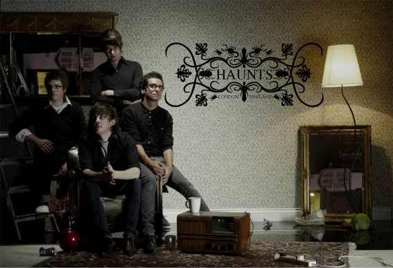
This is a photo shoot that ive art directed with the band, i have the same studio at my disposal for free to do another couple of shoots. For this i got all the props and built the set using fake walls ect.

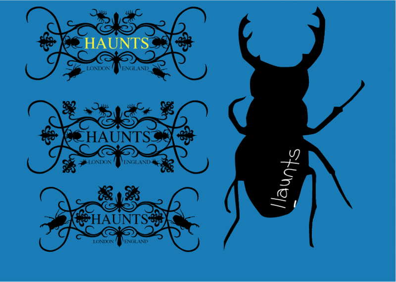
Just a few logos ive been messing around with.... need much more work.

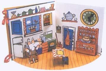
This is an example of the style of pop i intend to use in the packaging of the gatefold vinyl, although i am awaiting costing production Vs the budget. (obviously to presented in a different graphical style)

6 comments:
Just had a look at your site, took ages to find that damn button! So seeing as it's your band, i guess you don't have the problem of pleasing your client, 'cos it's you! Like the 'Haunts' logo, but it's missing something...Cockroaches. It really should have cockroaches, don't ask me why...
But yeh it looks really cool!
Christine
Alex...good stuff, I said this recently- just wondering why the other guys in the group are not offering up their comments?
GTS
im not sure about playing up the cockroaches too much-saw an almost identical logo on a record the other day-i like the rest of your images though-the theatrical element is a cool focus!
Rachel
BOOM, yeah im going off the idea of it being quiet so clean cut, im gonna take it more punky and try and capture a bit more of the british vibe. was thinking about in the photoshoot to kind of recreat a brinatia kind of figure, but were worried about conitations of BNPism and stuff, but i dunno, is it bad to have a union jack? spoken to the other guys in the band and we cant decide.
that was me... ALEX by the way, commenting on my own work to make myself look cooler. then reafirming that it is me with another comment to make me cooler still. i dont know how all you guys can stand being a class with me.xx
Alex
i dont think its bad to have a union jack at all, the only thing with making it punkier is that it might become a cliche of all the other punk stuff out there-it's hard to get a new angle on it.
Also dont you think that lately indie bands are making their videos-promos etc much more artistic? There seems to be a revival of stopframe in indie videos-more organic images. I dunno just something to think about
Post a Comment