Tuesday, 6 March 2007

Final Project - Karina


Hello everyone! I have posted my idea before about exploring Russian graphic design. My idea is to see how it is developing at the moment, and compare it to the British graphic design industry. I have already sent an email to Academy of Russian graphic design, where I explained my interest in what they are doing and asked them for some information. And now it is a big concern for me that this project is very broad, so I seriously need to narrow it down and think about the outcome. I would really like to work on this project, because I have a strong interest in it, and would like to know more about it.

So to narrow it down…

For my Final Project I’m going to explore the notion of Russian agitation posters, mostly during Soviet time, I’m particular interested in this because agitation posters were the foundation of Russian graphics.

Outcome:


Produce my own agitation posters, using the style and conception of traditional Soviet agitation posters. The posters will reflect the perception and the mood of our modern society and community exertion.

Aims:

• Research the history of graphic design in other culture
• Study the notion of Soviet poster
• Examine the structure, context, layout and overall design
• Produce my own poster, based on research, giving it a certain disposition.

Aimee- Glastonbury festival promo

Brief:

To design the promotional package for Glastonbury festival 2007, with reference to the going "back to basics" theme and intent this year.
The success of Glastonbury has meant that the advertising of it hasn't received a great deal of attention in recent years. The posters are basic, infused with too much colour and the design is repeated year after year. Charming as the posters are, the brand of Glastonbury is one people don't remember.

Motivation:

To create a visual identity that is refreshing and celebratory, whilst maintining the spirit and essence of the event.
To test the creative bounderies within a live brief for a worldwide established festival, which will also be an exercise to see the parallels of what I would produce, against those of the inhouse designer. This will include:

Posters
Adverts
Area Laminates:Performer, staff, guest, resident, camping
Vehicle passes
Entry tickets
Programmes
Glastonbury merchandise: t-shirts, wellies, hats, waterproofs

Here are some examples of previous years posters and current website:


Juliana Davies - Georgia's New Album

I received Georgia's new album and it sounds beautiful! A lot of different options to work with! I've updated all the info on my blog, if anyone wants to take a look! unfortunately I can't upload the tracks to my blog, but i can email them if anyone is interested in listening!

Link to individual Blogs

Hi guys

I've added a links section that takes you to individual blogs just on the right. Sorry if i've missed anyone out - you can add your own link in the template section of the blog settings...

Anna

Make a name for myself - Alex Kirmitsis

Since the FMP is a great opportunity to promote the paths of graphic design that we are most interested to follow in the future, I would like to operate within the field of web design. I would also like to focus on the live market of Nicosia, Cyprus, since it is a market that I’m familiar of and easier for me to approach, as well as because it is a thriving and progressing market, since Cyprus’ inclusion in the European Union.
My aim will be to research and track down several companies, preferably ones that represent international brands, and design their websites. Some of them may already have existing, running websites, which I will attempt to re-design. The companies and enterprises I will select (or better, try to select) will be from various domains of the industry (fashion, music, medicine, property, sports etc), so that the project will have an interesting variety. All websites will have a similar and familiar layout, since my aim is to introduce my personal graphic touch in all the works so that they will appear balanced and in proportion when assembled and viewed together.
I have started researching and enquiring in the Cypriot market, anticipating to find worthwhile customers before I write this proposal. So far, I have found 3 companies that agreed to participate in this task. Fortunately, all of them from different industries.

1. Kirmico Ltd. is the official representative of the KYOCERA printers in Cyprus, also responsible for the importing and distributing of scanners, faxes, shredders and other office machines.

2. ESPRIT. The famous worldwide clothing brand.

3. Deep Horizons Recordings. The first electronic/dance production studio in Cyprus with a 7-year experience in house music production and DJing.

The project will be a live brief since the constructed websites will be published on the net and will be running normally. I will endeavour to overall find at least 4 or 5 different companies ranging from as much types of business as possible to create my collection of websites.
14 weeks will be just fine.

Joanne Separate Blog

Hello all,
Have joined the rest in setting up my own blog. Looking a weeny bit anemic at the moment, but it'll grow up to be big and strong blog, just like the others.

http://joannekproject.blogspot.com/

does anyone know how to add it to the list?
Cheers Mes Dears

Monday, 5 March 2007

70 Projects in 70 Days...Melissa Bavanandan


Key Points:

1)Project/ Structure
2)Motivation
3)Range
4)Clients to date
5)Outcome

Project/ Structure:
70 projects in 70 days – one project a day, for the 10 weeks until the Exhibition (14weeks- 2weeks assigned to secure information for work- 10 weeks worth of daily projects- 2 weeks to document, print and publish for Exhibition).

Motivation:
The ultimate challenge in terms of working in the world of Graphic Design.
This will also establish great contacts with various clients, and be a platform to exercise my love for working with people and organising.

Range:
The projects will range in time, scale, medium and genre.

Clients to date:
1) Music Band - Battle, signed to EMI/ Warner Brothers.
2) Car Graphics-private seller
3) AAR- Law practice
4) Metographic Jewllery
5) Sam Greenberg, fashion label, Carnaby Street
6) Private Buyer
7) Le Gun magazine
8) Senior Citizen Association, SELWFA
9) Solo artist, Paco Pais, Spain
10) Private Electrican
11) 1st year Photographic project
12) 2nd year Clip Art project- to be published in June
13) Private Buyer
14) St George's Charity shop
15) Graniph Design Awards
16) Smarty Pants, Dry cleaners
17) Chelle Griffiths
18) Rendevous (Timi Adedji DJ)
19) Elim Church
20) Apple, Regent Street
21) Lizzie Finn
22) Andy Steven, Graphic Design Facility
23) Guys, Kings and St. Thomas Cricket Club
24) Model, Lauren Rippingham, signed to Premier Model Agency
25) Funrun, sponsored by Volvo
26) Duke of Cambridge pub- wine menu
27) Iain Armstrong- production of 13th Floor, TV show
28) SELWFA, newsletter
29) Lahori Baba restaurant
30) Asya Samilbegovic
31) Designer cake
32) Textile specialist, Trinidad
33) Fashion Designer, Shantel Dyal, Canada
34) Rendevous
35) Battle
36) Florist, Julie Walten
37-44) Duke of Cambridge pub- posters
45-6) Post Office, N4
47) Sirens, Carnaby street
48) Designer, Ally Waller
49) Cheese and Fickle, Designer bags
50) Communist Activist, Sofie Buckland
51) Private cake specialist, Trinidad
52) Youth Development Scheme
53) King's College London Islamic Society
54) King's College London Bangladeshi society
55) J4Y- Youth Today, Leaders Tomorrow Assoc.
56) Lazy Oaf, Carnaby street
57) Never too Busy to be Beautiful Cosmetics
58) Lush
59) Toyota
60) Channel 4
61-66) Awaiting response/ in negotiation.
70) Wonderland magazine- Final piece will be published in June edition.

Outcome:
A separate gallery space that houses-
- All of the 98 projects (to be displayed in a catalogue).
-Individual documentation from point of contact to delivery.
- Various timelines/ timetables and charts to document them as a set and how they relate to each other.
- Feedback from all clients.

Anna Rhodes... in a spot of bother

I've just got my quote back from the maufacturers, and it's going to be insanely expensive.
You can see the emails at http://annarhodes.blogspot.com

It's clear I need serious fnancial help - funding or sponsorship. Does anyone have any ideas?

Anna

Mary Bogatcheva FMP

By winding up/‘punking’ various types of people, whether it is on the phone, in person, by mail/email, etc people’s reactions and their judgement may show the fundamental attitude of our modern day society. I plan to create possible scenarios where I can enquire information, direction, help & advice from people whilst testing their patience with a number of wind-ups.

These will include: seeing if I get judged trying to do everyday things dressed as a funny/evil character/person, or having a small ability to speak English, a difficulty to understand the person… (And many, many more I need to think of in order to record interesting footage on camera, video, and voice recorder.

14 weeks is a long time, and I think I will enjoy the challenge of going out and recording some funny/interesting/bizarre/cringing footage. The research I will collect I will use as a fundamental part of the final outcome(s) for my FMP, which may include illustration/type/photography/image-manipulation work that I want to work with & enjoy.

Sunday, 4 March 2007

Michelle Griffiths: make me famous


As exciting as my project is, I need to consider possible outcomes so that the work I do on my journey to celebrity world can be recorded in the correct way i.e photographs, video etc. I have saved all my emails that I have used to pester companies about jumping on the bandwagon of my fame so I can also consider using them. I was also thinking of advertising a website address along with everything I do (on poster campaign, on wall in House of Fraser) so that I can record if people are actually looking to see what 'this girl that keeps appearing' is all about.
I do not really want to make a scrapbook/diary.
I also am not keen on just having the website at the final show, plus I am rubbish at websites and the one I will have will be quite basic with just pics of what I have done in the 12 weeks.
I was thinking of maybe a series of magazine articles, all different styles (copying the styles of heat, elle, vogue etc) each one explaining one of the methods I tried to get famous with plus outcomes...
Any ideas would be really helpful, thanks guys.
Michelle

Saturday, 3 March 2007

Friday, 2 March 2007

Tara Hughes - Development of schadenfreude/guilty pleasures idea

The idea of a zoetrope of contemporary scandal focuses purely on imagery, so I want to explore the influence of language present in the text and print of popular newspapers and magazines.
My proposal is to collect daily, 1 tabloid, 1 broadsheet and 1 trashy celeb magazine (weekly) and cut out any instance of scandal/mockery/humiliation written purely for the readers pleasure – a Schadenfreudian pleasure. The writer John Portmann suggested 4 reasons for this feeling; Comedy ,Commitments to justice, Low self-esteem/ego boost and Malice.
Each comment, headline, article or image would then be archived within a book or newspaper format with details of the source, date page numbers etc.

In keeping with the initial idea of using a traditional Victorian moving image device to comment on the change in social entertainment, I want to construct an unassuming setting of a corner of a Victorian living room containing;
- A chest of drawers which would hold all the cut-outs categorised according to Portmann’s criteria.
- On top of the chest, a zoetrope with a perforated book of optional strips to slip in and watch.
- Beside, the archive book (perhaps in the form of a Victorian book).

So… from the outset, the scene would appear to contain innocent, traditional entertainment pieces but on closer inspection contemporary scandals/events would unfold.
The remaining sheets from the cut-outs would be displayed as wallpaper/hangings within the set.

To bring the project round full-circle, and also to look at the issue of temptation, I would like viewers to the show to have the opportunity to participate by taking a ‘guilty pleasure’ snippet from the drawers (perhaps held in small, glass jars), finding out where it came from in the archive book and then take the original printed sheet from the wall to gain the whole picture and context.

Finally, (if it worked) all that would be left is the collection of texts and perhaps a logbook detailing how the information and imagery made people feel (according to Pormann’s criteria).
If everything had been taken, would it be true to accuse the media of encouraging Schadenfreude or perhaps we just can’t resist the natural temptation to witness another’s downfall?!

Any feedback appreciated

Thursday, 1 March 2007

Another idea! - Stephanie

When going to an art gallery, we see all these paintings from one certain artist and that made me think of showing my work, but in another way : instead of having lots of paintings, just have one that regroups all the other paintings.

My final project will represent all the work i've done since coming to Chelsea.
I've been thinking of gathering together all the work i've done since Foundation and creating a new piece of work. These would be transferred onto a canvas, material (unsure about the medium i'll be using : could be silk-screened, printed on, stitched on, painted, or maybe a mix ..)

CMZ's FMP

After much dwelling I have decided I want to do a live project in the identity and communication area. The association in question is called 'EYES'. EYES is an international networking platform for extraordinary young individuals with unique entrepreneurial talent, they run an interactive intranet which allows members to keep in touch and share knowledge. I would be working alongside one of the core members and would have a real brief with already set dates.

Problem:
Current brand image is mis-aligned with its core target: the EYES members and candidates. Lack of an official communication strategy consequently resulting in the organization's under-performance. http://www.eyes-online.org/

Aims:
Develop a new communication strategy to improve member involvement, excitement and ignite entrepreneurial behaviour; increase sense of ownership.

Deliverables
1. Improve brand image
- Style Book: new branding scheme
- Apply above across all existing media
2. Develop new communications strategy
- Internal
- External

carla.

Anna's new blog...

my new blog is up at http://annarhodes.blogspot.com

Joanna Zhou - Gashapon Blog

I will continue updates of my FMP at this address: http://joannazhoufmp.blogspot.com.

David Roberts: Poisoned Whiskey Records

Poisoned Whiskey Records in an underground an up and coming independent Record label based in South Wales. Their aim has always been to help the music community in South Wales. Both bands and people involved in the music community (Photographers, Journalists, Promoters, Designers) are actively encouraged to contribute to Poisoned Whiskey's events. Poisoned Whiskey Records did a lot to help me in when I was back in Wales.

Their own description of what they do is:

"We're a very proud DIY Record label based in the hideously dark and scary Rhondda Valleys in South Wales. Punk rock by nature, not by genre, Poisoned Whiskey is a group of like minded individuals who are about music and camaraderie, supporting our local scene and supporting our friends, whether they be band's, writer's, artists or vagrants. We put on gig's and club nights around our area, always paying the band's, and putting the rest back in to the label to release kick ass records!!!"

I'm waiting full confirmation of what they need from me, but I will be conducting a full overhaul of their design output in order to assist with their push to reach out further.

Preliminary discussions has raised this list of outcomes for consideration:

Website
Poster Layouts for future gig promotions
Flyer Design Layouts, Stickers
Merchandise.
Press pack for promoting the label and it's bands further (maybe including a Dvd, with brief promotional video)
Web virals to spread through the web.
Design and promotion for a future record release.

Olga, The meaning of your name

Recently i read a book about the meaning of name on our life and character. I find it really interesting and kind of bizarre to think that in a way our parents without even knowing it with a chosen name give us a particular part of character. I don't really know yet where to go with it, but i find it very fascinating.

Aimee Gillett - design for festival

I want to direct my final project towards a number of interests, one of which is events organisation. What better way to do it than to design for the event my hometown is renowned for? Glastonbury festival of music and performing arts.
I have approached the only designer of the festival, as well as the events organiser and asked whether they would be interested in me designing promotional graphics for the event at the end of June. Although they would like to maintain the spirit of the pyramid stage within their identity, (representing the glastonbury tour) they are open to new ideas for the festival's visual look to promote in and around the local area. The organiser has also informed me that the festival is preparing to open a new area this year called 'The park'. This will host live acoustic performances, DJ sets, poetry and plays, all in celebration of the very first festival 37 years ago and she would like this area promoted due to its new location.
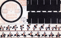
The body of the project will entail designing a visual look for the festival based on the theme of it going 'back to basics' this year. This will extend to: website, posters, schedule posters specifying events such as: film, plays, performances, tickets, vehicle passes, zone passes and guides handed out on site. All of which involve working alongside the designer and the organiser which I feel is a great opportunity. The specifics are not completely clarified at this point. I am meeting the designer and festival office manager on tuesday next week to organise in more detail. I would really appreciate some feedback on this project. I understand its a big undertaking and quite a bit of responsibility. I think its a great project to get immersed in.

Cristina Pais - My Antitype

I'm interested in the theme of my dissertation that is about the power of brands and how they influence us as consumers to buy their products. This is mostly based on their corporate identities and publicity, looking for a particular audience. They don't want to sell to everyone but to a particular public "their public". Therefore, they rely on design to show their personalities or brand identities. Then, we'll buy their product if we feel identified with the brand, to show something about us to the rest (Argos' public is different than Heals', Benji's is different from Starbucks, etc.). This make people feel that they belong to a particular group, and this is something that, according to my research, humans need.

I aim to challenge myself and forget about my own personal style when designing, using as many others as I can. With this I would like to reach different audiences, not just the public that share my taste and feel identified with what I produce.

The outcome will consist of different illustrations that won't look cristina at all. (To help people who don't know my work to understand this I'll have previous work showing my own personal style.) I will combine images and type and, at the end, they will take the shape of a book or a huge poster with all my antitype illustrations -you wouldn't guess I made them.

With this I want to explore my design skills and see if I'm able to forget about my style, and adapt my design skills to many different others. (The fact that is not my own personal style doesn't mean that I don't like the others, I just don't feel identified with them.)

I will try different techniques that I wouldn't normally use (like watercolour or collage) and this will show variety in my portfolio. I'll also use Fontlab and different printing options.

F.P.idea - Karina (update)


This is some graphic work I found, which is just going to be shown at 13th Exhibition of the Advertising Industry in Moscow this march, its called Design and Advertisement.
As a matter of fact, there was no foundation of Russian design – because of 70 years lead in not market space affect. Some people say there was no design in Soviet Union, whereas others say it was, for example one of Russian leading newspapers – ‘Hammer and Sickle’ - the best trade mark of all times. Some agree that the basic feature of the Soviet design - its isolation from commerce.
So going back to the idea of graphic design in other cultures, and my desire to explore it, I was thinking about the outcome. Looking at history of graphic design in Russia, for example, my home country, I would probably be able to meet designers working in this area (I also though it can be useful for me in the future). The idea is to see how graphic design is developing, what its stage level at this point. So to sum up, the outcome will be based on graphics, and inspired by graphic designers, who are appreciated in Russia now. I understand that it is a huge project, and I probably won’t have enough time to explore a whole area, but I would really like to start researching it and if I do hope to find the solution for the final outcome. To narrow it down I will probably be looking at Soviet agitation posters, and how nowadays graphic design in Russia has changed, what it’s inspired by.

Aims:

-Explore and research the development of graphic design (in the atmosphere of certain culture)
-Visit exhibitions, meet professionals
-Analyze and compare
-Produce the outcome

Wednesday, 28 February 2007

Mathew Wood Updated Post: Subverted Stationary


With designers seemingly conditioned by traditions when it comes to formal stationary, I propose to challenge the traditional form and notions for such occasions as christenings, birthdays, weddings, divorce and death to reflect today’s urban values.

Should birthday cards for boys still be represented as blue with a football, when the increase in childhood obesity has meant a lack of interest in sports participation and when the modern day celebrity icons of young boys openly portray their metrosexuality? Why do wedding invitations have to be represented as pure and white when the ideal of holy matrimony itself is being challenged by more contemporary relationships such as cybersex, dogging and swinging?

I aim to subvert the meaning of a whole host of formal stationary, and create the ultimate collection to represent contemporary
socitey.

Key Points:

1. Graphics designers seemingly conditioned by traditions

2. Challenging the form, use and tradition of a whole range of
formal stationary

3. Looking at occassions: Christening, birthdays, weddings,divorce & death

4. Subvert the meaning of a greeting in order to test the boundaries of conventinonal imagery and introduce irony into the commercial domain.

Anna Rhodes

Bullet Points for Thursday:

  • Begin by talking about my dissertation 'The Appropriation of 'Vintage' on Second Hand Clothes by The Fashion Industry'. Talk about the importance of Nostalgia in a post-modern world and the pros and cons of the current trend of it's use within design.
  • Explain that I will manifest this concept in a fully working, scaled up, adult sized children's coin operated ride. It will take the form of a giraffe, (see below) and I will talk about the reasons for this.
  • This project will bring together a whole manner of skills in terms of art direction, which I hope to pursue after leaving Chelsea.
  • On the 21st Feb I spoke to Patrick Lamb of Severn Lamb UK manufacturers who have agreed to make the ride for me. I will be involved with every step of the manufacturing process, making every decision, but will employ a project manager.
  • To accompany the ride I will keep and design a Log Book showing every step of the decision and manufacturing process.

Main aims for my project: "Getting famous in 12 weeks!"

My aim for this project is to

-Explore the potential of print and media to become famous without there being a particular reason why. This seems to be easy these days to be famous for nothing.

-I will use various methods to attempt to do this – I have not set boundaries.

To date
-Professional photographs being organised
-Harrods are interested in allowing me to use a shop window
-House of Fraser have agreed to give me a space in the store for promotion

This is my chance to
-Get an insight into ways of getting noticed within the industry
-test the media – see what companies are willing to help
-enter the world of PR
-push my own limits of creativity and test my own skills.

Events to be confirmed
- appearing on t.v
- poster campaign
-newspaper print / press

Main Points to Make - Joanne


I’m interested in the current gap in contemporary Fashion media. There is a lot of potential in using the technology available today to further the way the public interacts with Fashion and also the way that its media is produced.

Fashion media hasn’t progressed alongside other disciplines and is still very much dependent upon the traditional static photographic format. This project will endeavour to show that the way that Fashion is advertised can really benefit from the advantages a digital moving image and interactive platform has over print.

SHOWstudio has been my main focus/ motivation as they are one of the only collectives to really innovate and produce genuinely exciting work that pushes the boundaries of what fashion media is and how it is produced. Also, how this is a potential solution to their problem of not generating any profit. References shown: Thirty Men- Live Sittings and Synaesthesia Interactive.


That this project continues on from the research I’ve conducted for the Fashion in Film Festival and thesis that discusses the cultural production of Fashion- mainly Fashion’s adoption of the language of the Art world (both visually and literally). How this partnership generates artistic and intellectual capital that demands that Fashion be seen and discussed in the same way as Art and how this project seeks to provide a format for advertising that will build upon that.

That the boundaries will come from working with a client instead of measuring up to competitors, as there isn’t really anything similar at the moment.

Joanna Zhou - Gashapon Icons


Summary:
  • Introduce ‘gashapon machines’ into UK vocabulary and culture.
  • Highlight the increasing influence of Japanese culture in western countries and the novelty or alienation it entails.
  • Outline the functionality of gashapon machines (collectable item sets for children and adults).
  • Explore the notion of collecting objects in order to create a sense of purpose and belonging.
  • Design and make sets of gashapon which reinforce personal identity within cultural (or graphic?) contexts.

My FMP is based upon the gashapon machine. These Japanese vending machines have suddenly emerged in many European cities within the past few years, creating a highly visible icon of global culture. In Japan, gashapon machines enjoy a cult status because they dispense collectable sets of toys or novelty items which are extremely popular with all age groups (not just children). My aim is to explore the human obsession for collecting things and how this creates a sense of purpose and identity.

The location, content and functionality of a gashapon machine make these urges particularly acute, thus I plan to place several in the degree show to tempt visitors into collecting a slice (or more) of Chelsea! The exact contents are yet to be decided though I'm leaning towards themes of culture and/or graphics. In Japan, gashapon machines always contain things relevant to their environment (machines in a red-light district will actually dispense vibrators and thongs), so it seems appropriate, albeit slightly obvious, to link one in a degree show with design.

Current progress: I'm working together with a UK based company Tokyotoys to get hold of gashapon machines, modified for pound coins. Tokyotoys import a lot of japanese merchandise (including gashapon) and can provide all the balls I need for free. They're also willing to buy the machines from me afterwards to use at trade shows. I'm also sourcing factories in China that may be able to produce the items needed inside the balls.

Kimberley Vousden


Bullet Points for Thursday

- Begin stating my passion for tactile print in evermore digitized environment

- Explain that I want to hold an exhibition posing the question of the relevance/richness of tactile print in contrast with our evermore digitized environment.

-This exhibition will be held at the St Bride Institute, it's own plight of renovation or closure suggesting a general feel that analogue print processes have little to offer contemporary design.

- Spoke with Nigel Roche on Tuesday 20Th Feb, eager for me to be fully involved with committee; interested in incorporating American Branch of the "Friends of St Bride's" to provoke interest.

- Designers/enthusiasts will be approached to submit work/statements that best portray this and why they think the library is a valuable resource; They will be asked to offer work (perhaps inspired or researched using the libraries resources) and editorial that reflect their passion for analogue print. People such as: Alan Kitching, Derek Birdsall etc

- Promotional Material to be designed and 'printed' by myself for the event. Proceeds given to the libraries £7 million pound renovation project. Further promotions i.e newspapers, radio stations etc will be needed to generate interest. Separate online website is a possibility. Special blog site set up posing the question, 'Is the St Bride Library and what it stand for still relevant today?'

St Bride Library (Pre-Renovation)
AIGA Walker Art Center Brochure (Below)


P*nk you! (Mary Bogatcheva)

As the direction of my portfolio and of my future pathway is print based, I would like to base my FMP on a topic that would allow me to do so. By winding up / ‘punking’ people (of all ages) whether it is on the phone, in person, by mail/email, etc people’s reactions may show the fundamental attitude of our modern day society.

14 weeks is a long time, and I think I will enjoy the challenge of going out and getting some funny/interesting/bizarre/cringing footage. The research that I will collect will play an important part in the final outcome(s) of perhaps partly illustrational/type/photography/image manipulation that I am interested in, want to work with and enjoy.

Aleister Kelman: Intimate Apparel

  • My project will require that I engross myself in the psyche of the female consumer and that I engage totally with their considerations, wants and needs
  • I will be designing, from scratch, the look and feel of a lingerie designer including identity, photography, look book and online interface
  • Working closely with my client I am looking to create a new graphic that is mindful of obvious points of reference such as Agent Provocateur and avoids stereotypes, in terms of male gaze, domination et al.
  • In terms of the intimate apparel market my client stands at the high/luxury end owing to the bespoke, limited edition nature of her work (and this exclusive hand made aspect in turn informs the price accordingly)
  • To sum up the rationale behind her spring/summer 07 range, it is very much rich tones on tones, hourglass silhouettes emphasizing bust/hips, and absolute comfort for the wearer.
  • Throughout I will be working and coordinating with photographers, venues, make-up artists, hair stylists and models as well as communicating with marketing and press professionals.

Anna Rhodes

I have always been interested in things from the past - things I can remember and things that came before me. I recently wrote my dissertation around the current trend for vintage and second hand clothes entitled, 'The Appropriation of 'Vintage' on Second Hand Clothes by the Fashion Industry'. It was about the way in which the media took the age old idea of wearing second hand and vintage clothes - be it for quality or individuality, and bastardised and democratised the concept as a trend, thus changing the meaning.

Nostalgia, in our post-modern society plays a huge role. We are seduced by the idea of a mythological age that seemed less complicated, more safe and more charming.

Unfortunately, designers have come to rely on images and styles of the past to make their designs seem more warming to the client. I have seen evidence of designers who dress modern design in old clothes, a warm layer of nostalgia, as a way to make things seem comforting, whether the product/magazine/design is suited to the style or not.

I have manifested this idea into a project which will result in an adult sized childrens coin operated ride. This scaled up, bizarre object will be fully working. Around 7ft in height it will give the rider the same experience an original ride gives small children, an experience i'm sure most people have had in their childhood. The ride will be in the shape of a giraffe. (below)

Accompanying it will be a log book documenting the decision making process, and recording every step of the way - e.g. why i made it a giraffe, why a ride etc. It will be a celebratory and obsurd object that i feel will look great as a 3D object in the show.

Graphics will be available to look at tomorrow.

Anna

Tara Hughes Schadenfreude/Guilty pleasures

Ok a clarified version of my extended blog;
Outcomes surrounding the theme of Schadenfreude (pleasure in the misfortunes of others) and it's analogy within the term 'guilty pleasure'.

1. A victorian styled zoetrope (early moving image device)
- To human scale - for a heightened sense of relation and to be positioned in locations across the city inviting public participation in spinning the piece to reveal a celeb scandal.
- Questions temptation and media influence in encouraging us to delight in the downfall of high-profiled figures. Also highlights the shift from the machine used as traditional, family entertainment to how we get our thrills in contemporary society i.e. trashy mags, and reality tv.
- One zoetrope would be constructed with several monochrome graphic strips of scandelous/salacious events to be inserted.
- Overall motive could be to bring the tabooed emotion into the light and create a public platform for people to celebrate an accepted, natural feeling rather than a guilty pleasure.

2. Same outcome of a zoetrope but instead playing on the idea of the emotion being perceived as private and guilty so the piece would be a detailed miniature.
- portable, perhaps collapsable device so one could sneekingly lift their spirits, boost an ego, or gain a laugh.
- Sized for hand-bag, pocket, office desk drawer etc
- collectable strips of humiliating events to be inserted into main piece.

3. Photographic collection of Schadenfreudian reactions
- Smirks, smugness, giggles, subtle physical manifestations we all feel daily.
- Capture everyday examples eg. bus driver's smugness when closing doors to someone out in rain etc.
- Printed large scale with annotated descriptions to evoke uncomfortable feelings.

4. 'Guilty pleasures amnesty'
- Advertise for people in the city to donate objects, collections etc that they are ashmed to admit to loving/owning.
- Archive or catalogue the objects, perhaps build profiles of owners.
-Photograph them in an effort to find attractiveness/usefullness

Any feedback greatly appreciated.


Tara Hughes

My ideas seem to have become lost in the sea of blogs, so just to refresh and gain some more feedback...

GUILTY PLEASURES
As Schadenfreude is often considered the ultimate guilty pleasure, below are possible outcomes to this theme.

1. Though everyday experiences of Schadenfreude (pleasure derived from the misfortunes of others) are interesting on an observational level, I'm thinking more about the current climate whereby the media actively encourage us to feel the tabooed emotion and increase a hunger to see humiliating photos of stars or hear about the scandelous lives of politicians. I've thought of producing an outcome that highlights this media influence and social comment in a non-preachy way.
Therefore, an alternative, sophisticated method of re-telling a glossy, overhyped celeb scandal would be to present it in monochrome within a zoetrope (reminiscent of the Victorian era). This would also comment on the shift from what was considered traditional family entertainment to how we gain our thrills today.

The zoetrope itself would have most effect and a heightned sense of relation to the viewer if it were to human scale. One piece would be constructed with many graphic strips of the embarrassing misfortunes available to slot in.

Considering the scale of the piece and the fact that it would be positioned in various locations in the city (particularly squares, as almost circus/freak show events) it would invite the ultimate opportunity for Schadenfreude as the public would be in control of it's movement. Without their participation, the scandals/misfortunes would not unfold and so again it plays with the idea of temptation.
Perhaps the whole motive could be to take the stigma out of an emotion we all feel but deny to exist. Making the experience so public could take it from being a guilty pleasure, to one of accepted celebration!

2. The opposite of a celebrated pleasure would be in considering Schadenfreude as a 'guilty pleasure'. Therefore, perhaps the above idea would work on the complete opposite scale of being a miniature zoetrope produced in beautiful detail, and designed as a portable device to sneekingly lift one's spirits, boost an ego or to gain a malicious laugh?

3. Simply, a photographic collection of hiddden Schadenfreudian smirks and giggles from all walks of daily life. For example a bus driver's self-satisfaction when closing the door to someone left standing in the rain, a student's subtle glee when a fellow competing peer has their work critised and so on. Small-scale subtle shows and physical manifestations of Schadenfreude rarely noticed but captured on film. The images could become large prints annotated to describe from where such smugness was retreived creating uncomfortable reactions amongst viewers.

3. In isolating this term of the 'guilty pleasure', I thought of finding out exactly what people in London are ashamed to admit to loving or owning. As a nosey person I'm always intrigued to know what people have hidden under their beds, in their bottom drawers and hide away when they are expecting visitors.
The idea would be to advertise for a 'Guilty Pleasures amnesty' where the public would hand in all their embarrassing and cringeworthy objects, clothes, ornaments and nerdy collections. The objects could be archived and photographed in an attempt to find some glimmer of attractiveness or purpose.

Ana Freitas - Brighter Journal 2 (update)

Brighter Journal > Issue 2

  • The second edition of the Brighter Journal: a very real way to explore my design skills and boundaries whilst pursuing my fascination for the world of publishing

  • I will be working as art director alongside a small editorial team of 3rd year GDC students who will contribute toward the journal, creating a broader and more relevant set of contents

  • Journal's design/aesthetics will be connected to the final degree show theme, interpreting 'bright as light', as opposed to heavy/darkness

  • I will combine new approaches to typography/print/material/size and distribution to give the journal a fresh feel

  • F.P. - Karina

    Hey! I also was thinking about another idea, I know it might sound silly and not worth to spend 14 weeks on, but I was thinking, you know how we keep posting idea after idea all the time since this blog started, hoping to get it right and if it is not we just find another one and so on and so on. It would be interesting to just gather all ideas from this blog, the ones which weren’t successful and maybe produce something, like a ‘Portfolio of what not to do for Final Major Project’ or maybe try and use all unsuccessful project ideas and compare them to the final outcomes. This is just something to think about, any suggestions?
    Thanks guys

    70 Projects in 70 Days...Melissa Bavanandan


    Key Points:

    1)Project/ Structure
    2)Motivation
    3)Range
    4)Clients to date
    5)Outcome

    Project/ Structure:
    70 projects in 70 days – one project a day, for the 10 weeks until the Exhibition (14weeks- 2weeks assigned to secure information for work- 10 weeks worth of daily projects- 2 weeks to document, print and publish for Exhibition).

    Motivation:
    The ultimate challenge in terms of working in the world of Graphic Design.
    This will also establish great contacts with various clients, and be a platform to exercise my love for working with people and organising.

    Range:
    The projects will range in time, scale, medium and genre.

    Clients to date:
    1) Music Band - Battle, signed to EMI/ Warner Brothers.
    2) AAR- Law Practice.
    3) Metographic, Jewelry Company.
    4) Le Gun magazine- competition entry.
    5) South-East London Welfare Assocation.
    6) Solo artist, Paco Pais.
    7) St George’s Charity shop.
    8) Fashion model, signed to Premier Model Agency.
    9) Graffiti Designer, Mark Bajade, shop based in Carnaby Street.
    10) Fashion designer, Canada.
    11) Communist Activist, Sofie Buckland.
    12) DJ, Timi Adedeji.
    13) Elim Church
    14) Textile specialist, Trinidad.
    15) Second year project- contemporary clip-art- to be published, June.
    16) First year project
    17) Private Electrician.
    19) Cambridge Student Union.
    20) Private buyer.
    21) Private Business.
    21-31) Awaiting response/ in negotiation.
    70) Wonderland magazine- Final piece will be published in June edition.

    Outcome:
    A separate gallery space that houses-
    - All of the 98 projects (to be displayed in a catalogue).
    -Individual documentation from point of contact to delivery.
    - Various timelines/ timetables and charts to document them as a set and how they relate to each other.
    - Feedback from all clients.

    Karina - another idea for F.P.


    Landor Associates, the world's most accomplished and internationally recognized branding and design consultancy, has recently created a logo and slogan for a new Italia. it portal, which will be illustrated at the BIT international tourism trade fair in Milan. The new logo uses the 'it' abbreviation for Italy and the red, white and green colors of the Italian flag. The abbreviation is on a white background with a red dot over a classic black 'i' and a green letter 't'. This was done to promote the country as a brand in areas like tourism.
    This gave me an idea, which can be good for Final Project. I was thinking about Italy, its great culture, history, traditions, food and fashion. And I realized I want to explore its graphic design ability. It is a known fact that Britain is famous for its design skills and its design history. So I would like to see how graphic design is developing in other countries, through other cultures. For example, graphic design in Russia, was very successful during soviet time, and stopped developing up until recent years, but now the difference is very noticeable. My ambition is to see how graphic design is developing in other countries and see how it is affected by cultural, political and social increase.

    Michelle Griffiths: make me famous


    This is some examples of the illustrator's work who is going to draw illustrations of me on the wall in House of Fraser.

    My aim for this project is to

    Explore the potential of print and media to become famous without there being a particular reason why. This seems to be easy these days to be famous for nothing.

    I will use various methods to attempt to do this – I have not set boundaries.

    To date
    Professional photographs being organised
    Harrods are interested in allowing me to use a shop window
    House of Fraser have agreed to give me a space in the store for promotion

    This is my chance to
    Get an insight into ways of getting noticed within the industry
    test the media – see what companies are willing to help
    enter the world of PR
    push my own limits of creativity and test my own skills.

    Tuesday, 27 February 2007

    cristina... Default Font / Stereotypes vs Antitype

    Thank you all for the collaboration in the blog. I think I got where I wanted now but I still have two different but similar ideas going on and on in my head related what i have explained before in the blog.

    First idea: my aim is to design myself the "default" font. That is a font that you can use for every design. Therefore it would have, instead of the typical bold, italics,etc., a great deal of possibilities from sophisticated, elegant, beautiful to punched, cut off, messy, etc. So that you can adapt it for all your designs (a heavy metal band or a fashion magazine).
    Besides, I would show examples of designs (one per category)

    The other idea: to put together 2 opposites: stereotypes and anti-types (the word anti-types means there's no different "types"/kinds of design, annihilating every category that we can find -like the "list" mentioned before-). So it would be a visual representation of what it would be, "design" with just one possibility or design as it really is, with all its richness. So no design and design, to show the importance of our career.
    This could take the form of a book with two covers -the back and the front- that you need to turn over in order to read/see one or the other. One side would be really boring and the other one really rich (antitypes and stereotypes).

    Any suggestions would be much appreciated.

    Aleister Kelman: Susannah Katz

    • My project will require that I engross myself in the psyche of the female consumer and that I engage totally with their considerations, wants and needs
    • I will be designing, from scratch, the look and feel of a lingerie designer at the limited edition/ exclusive end of the market, including identity, photography, look book and online interface
    • Working closely with my client I am looking to create a new graphic that is mindful of obvious points of reference such as Agent Provocateur and avoids stereotypes, in terms of male gaze, domination et al.
    [Two more bullet points to be added tomorrow afternoon pertaining to market research and seasonal design but need a little more info to get these down... got some quite cool stuff to say about research on the web interface after a discussion tonight.]

    Ivy Amoah

    1. Through the eyes of a child
    I’m thinking of doing something that I would love doing, something to do with (surprise surprise) kids. The idea is to ask 50 (maybe less or more) children of what they would do if they were a final year student at Chelsea and then collaborate with these children and produce all the work they propose. It could be 'the 11 year old Chelsea student's portfolio'

    2.101 uses for a single object
    This idea is to look at household objects that we often regard as insignificant and find out other uses for it. For example what else can one do with a 'garlic crasher'?. This could take form in a book format like the '40 fact you wanted to know about Chelsea...' prospectus?
    Does anyone think this is worth a 14week FMP?
    Feedback would be most appreciated

    Teresa- Final Project Idea

    I would like to relate my FMP to my dissertation theme, which was the physical relations within urban communities through printed matter and self publication, and how the tactility and physicality of these objects and the particular ways in which they're created and passed around are bound to bring people together in a humanized, creative, de-alienated environment. It also highlighted the importance of being physically involved with the creation of one's one "entertaining objects". I would like to base my final project around the relation of the handmade and craft with contemporary forms of communication (blogs, sms, chat-rooms, etc).
    I'm not sure what the outcome would be, but i would like it to be print-based, as it seems appropriate to explore the tactile qualities of paper for this subject, and also because it is compatible with the direction i would like to take in my portfolio of work.

    Final Project Idea - Karina


    I have been posting different ideas for the last couple of days and tried to narrow down the list of all the ideas I had, just to see what someone else thinks, so thanks for your comments guys.

    Finally I have two ideas; I hope I can develop one of them into a project…

    Point of view

    The idea is to look through someone else’s eyes, for example a cat or a dog and see how pets see everyday life and maybe even guess what they think! I am very interested in this because I always wondered what, for example home pets think about their masters. Pets we love and cherish, what their life is like? Obviously this topic has been talked about and been discussed before, but I think it is very challenging to try to express it visually. My plan is to observe the life of several pets in a period of time, trying to catch the emotions and feelings of every aspect of their lives. The outcome will be something difficult to decide on, because there are so many books about pets’ lives, for example ‘The Dog Day Book’ and so on, but I am going to concentrate more on the idea, and try to convey the result of my research to the viewers.

    Past Life CV

    The idea is to write a CV for some iconic people, historical heroes, such as the King Henry VIII, Marilyn Monroe (thanks Christine), William Shakespeare, Alfred Hitchcock even maybe. And try to send it out and see if they get invited for a job interview, like a historical job hunt. The CVs will be written based on characters’ profiles. The final outcome can be anything from visual representation of the made up CVs, to represent the idea of how the past works with the future, and if such iconic personalities could survive in our time.

    Monday, 26 February 2007

    another idea! - Stephanie


    Sometimes road signs can be tricky. U're in the car, faced with a road sign and you have no clue what it means. Some are over-complicated, unclear, you can't even guess because you might end up in an accident, more or less violent.

    I want to re-make the road signs, but easier to understand. Signs that you won't need to study beforehand to know what it actually means, you just see it and get it.

    Updates from Juliana Davies

    I’ve taken Michelle’s and Aleister’s lead and created my blog space to post everything relate to my FMP – After this update, I will post new info on my blog!
    http://www.jdaviesfmp.blogspot.com/

    The brief:

    To work with the young and talented British jazz singer Giorgia Mancio, she has a new album to be released this summer with no record label – I will produce (up to now):

    • At least 1 video-clip
    • Promotional package
    • Album cover
    • Poster

    I am still negotiating with her what she needs/wants – and how / what is the best way to promote her new album, so the above products may change (for more!).

    If anyone is interested Giorgia Manicio’s site is: http://www.georgiamancio.com/
    And if you go to "CD samples" you can listen to 30sec excerpts from 3 different songs.

    Oliver Simpson - Soul House


    This project concerns communication with the dead.

    Almost every culture has strong relations with ancestors and spirits and our multicultural society provides ample material for this purpose. However, in London we remain strangely disconnected from the spiritual world.

    I would like simply to provide shelter for homeless spirits in the form of small structures. Form and ornamentation will be well considered and will be adapted to reflect contemporary values - although the meaning will be universal.

    This is not a morbid evocation of death, rather a celebration of common human experience.

    I am enchanted by the marvellous collection of artefacts housed by the British Museum in its 'life and death' exhibit, sponsored by the Welcome Trust. They have written,

    People around the world seek well-being for themselves and for their communities in many different ways.These differing approaches reflect the ways they understand their world. Some people see well-being in terms of the individual and the body. Others think of it at the level of the community, requiring the maintenance of important relationships. These relationships might be with other people, animals, spirits or the earth.